|
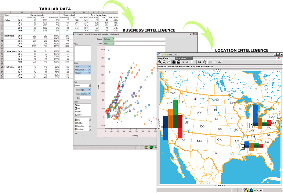
In this example, Hyperion Visual Explorer
has been used to present the
spreadsheet data as a scatter plot graph. This graph
illustrates a number of views, or measures, into
the original data, such as type of soft drink sold,
where they were sold, what the net dollar sales were
and finally, how much was spent on marketing each
drink within each region. Using a graph to display
such multi-dimensional presents a number of
challenges as graphs lack the ability to easily
represent data spatially. By making the data
location aware, Localligence is able to display the
same data on a map utilizing the strengths of graphs
while at the same time providing greater clarity and comprehension through the map. From this view managers
and analysts can quickly and
easily see which regions are performing best or
worst, and then drill down (zoom in) into the
map to get even more granular information, such as
sales performance at the state level, city level or
even store. |